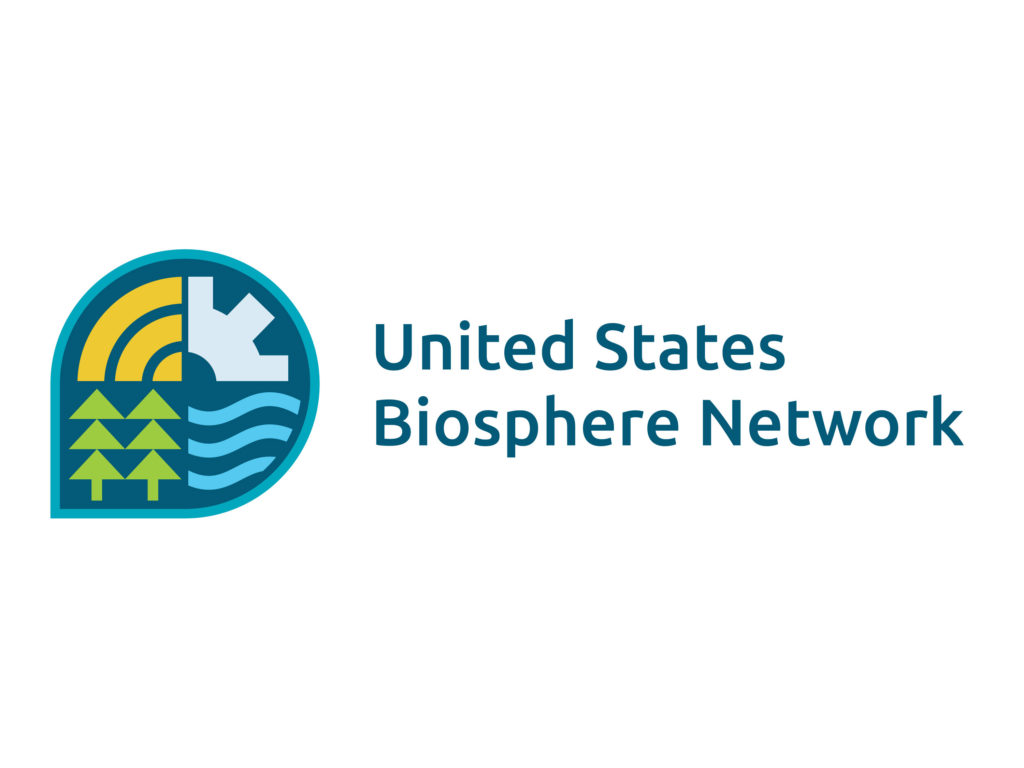
We are thrilled to showcase our new USBN logo in this newsletter. The logo is a big step forward in creating a unified USBN presence both online and in print.
Many thanks to Westerly Creative Studio for their thoughtful design work and collaboration with the USBN Steering Committee and Communications Committee in creating this logo. They provided this description of the logo symbolism:
- The outline of the USBN logo represents a location marker and a conversation bubble. Biosphere locations and conversations are at the heart of the USBN, so these symbols encompassing the others is a perfect fit.
- These three golden arches represent agriculture (specifically fields of wheat), hope, rainbows, and even wifi signals that allow for further connection and communication. Here we are reminded of our wonder and optimism.
- This general tree symbol represents the wide variety of trees within the USBN and acts as a reminder to the importance of uplifting, forward-moving action that our communities and local landscapes can benefit from.
- Biospheres aren’t just about nature — people are a fundamental part of them. We live in biosphere regions, visit them, work in them, and rely on them for our quality of life. This symbol is a cog representing the human aspect of biospheres: human industry, presence, impact, and reliance on our surrounding environment.
- These wavy lines represent the precious resource that is water, be it fresh or salt. When discussing local concerns, water is a common unifier among people and places.
We’d love to see the new logo on your biosphere region’s website; send an email to Cliff_McCreedy@nps.gov to get the style guide and related files.


